
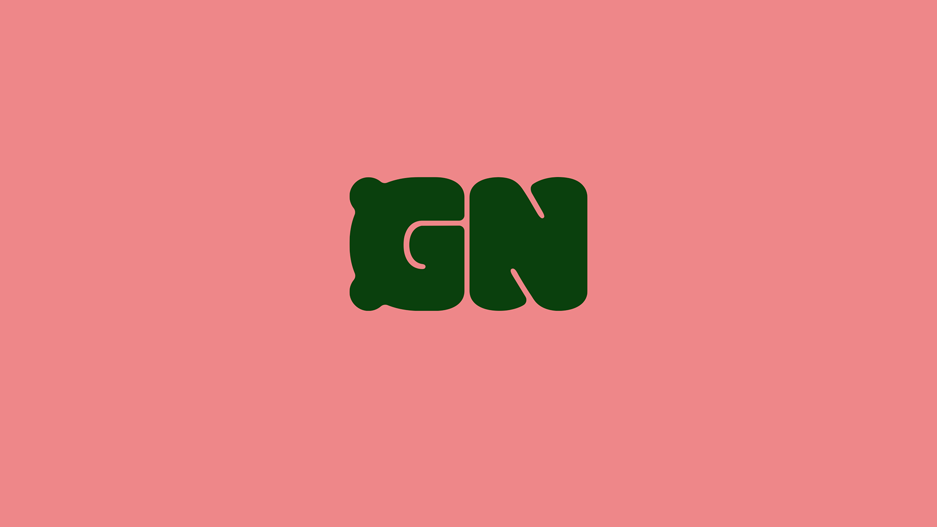
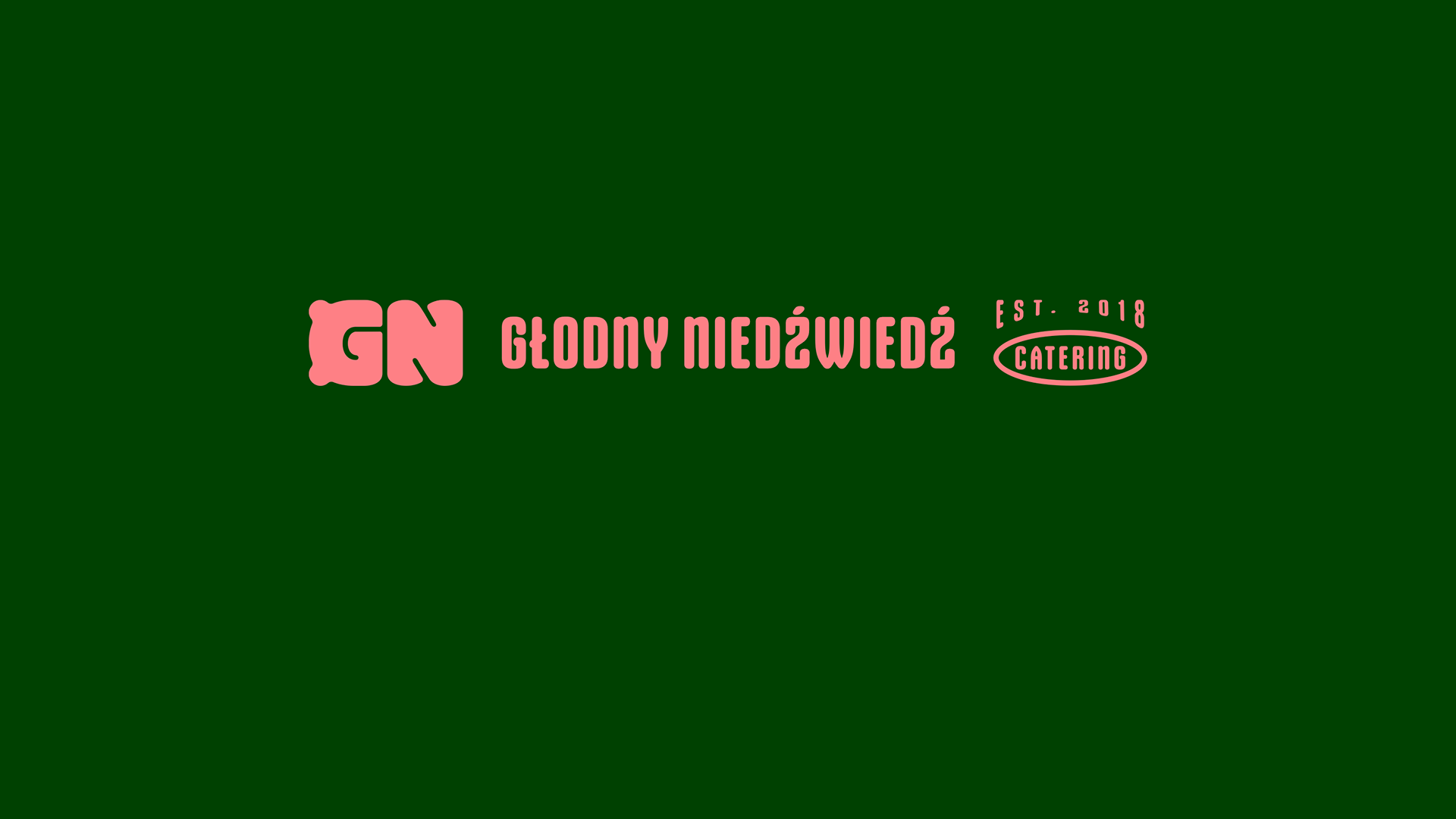
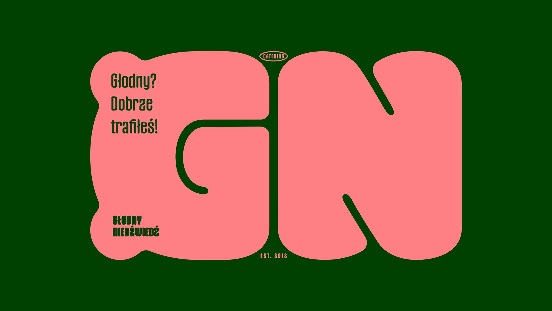
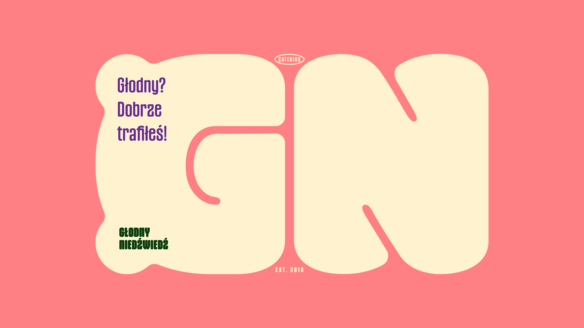
Głodny Niedźwiedź is a catering brand that came to me looking for a fresh new logo. The idea was to keep the bear motif, which had previously been used in a more illustrative way, but turn it into something simpler, more modern and minimal.
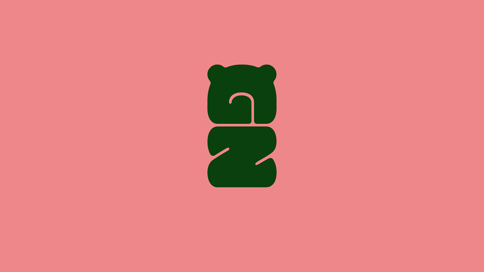
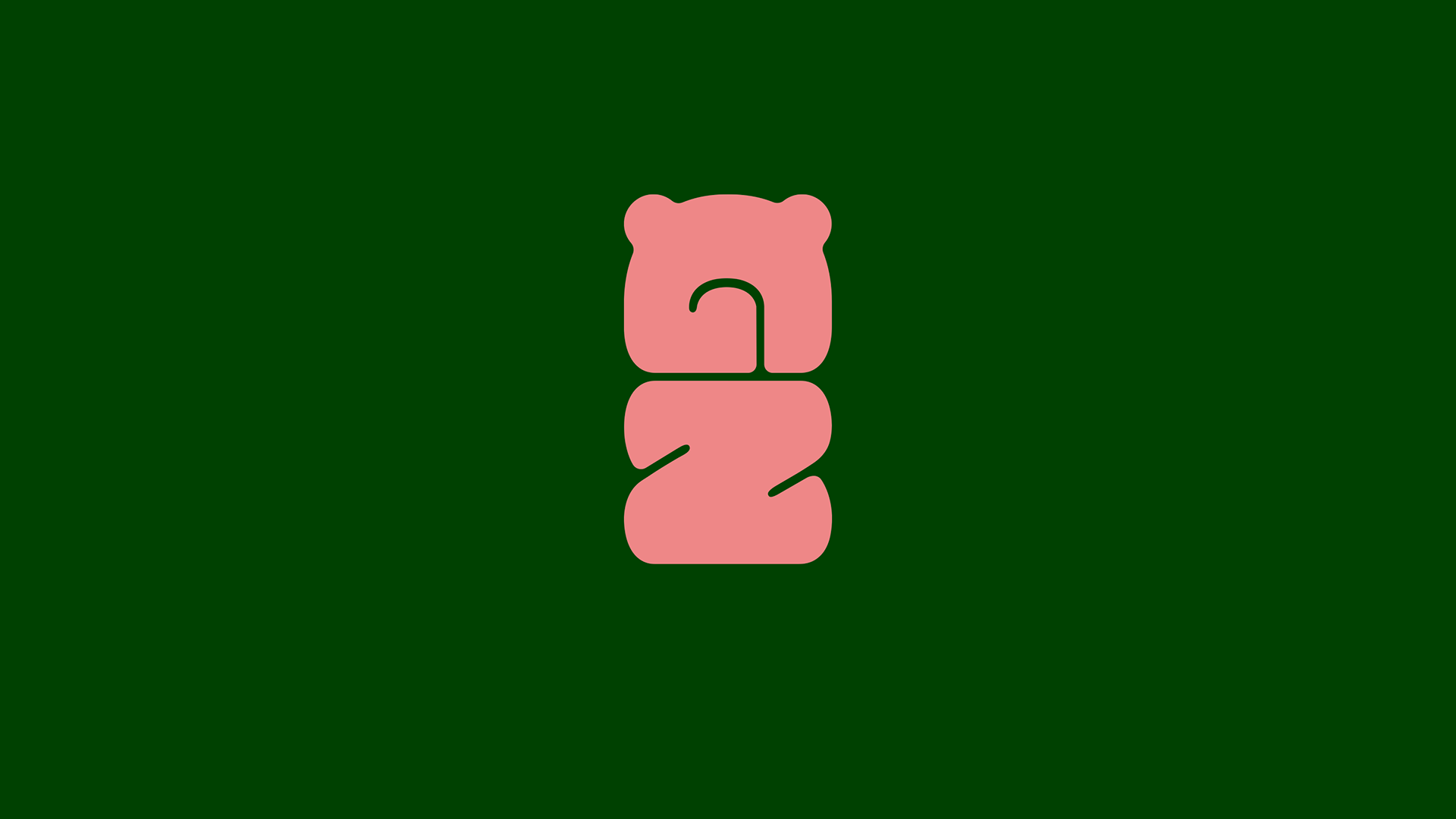
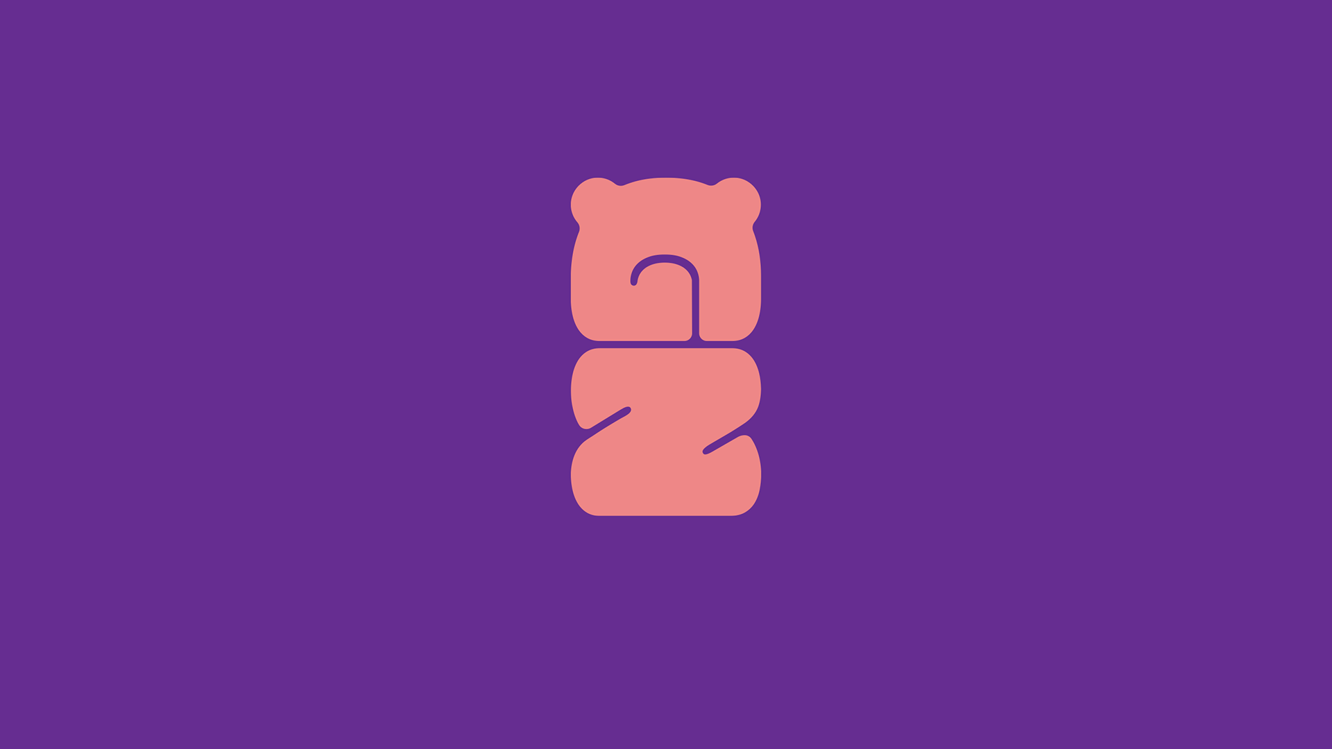
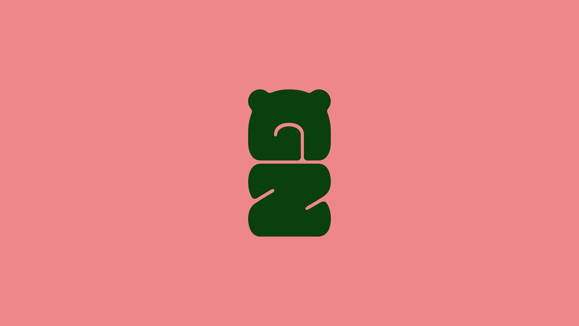
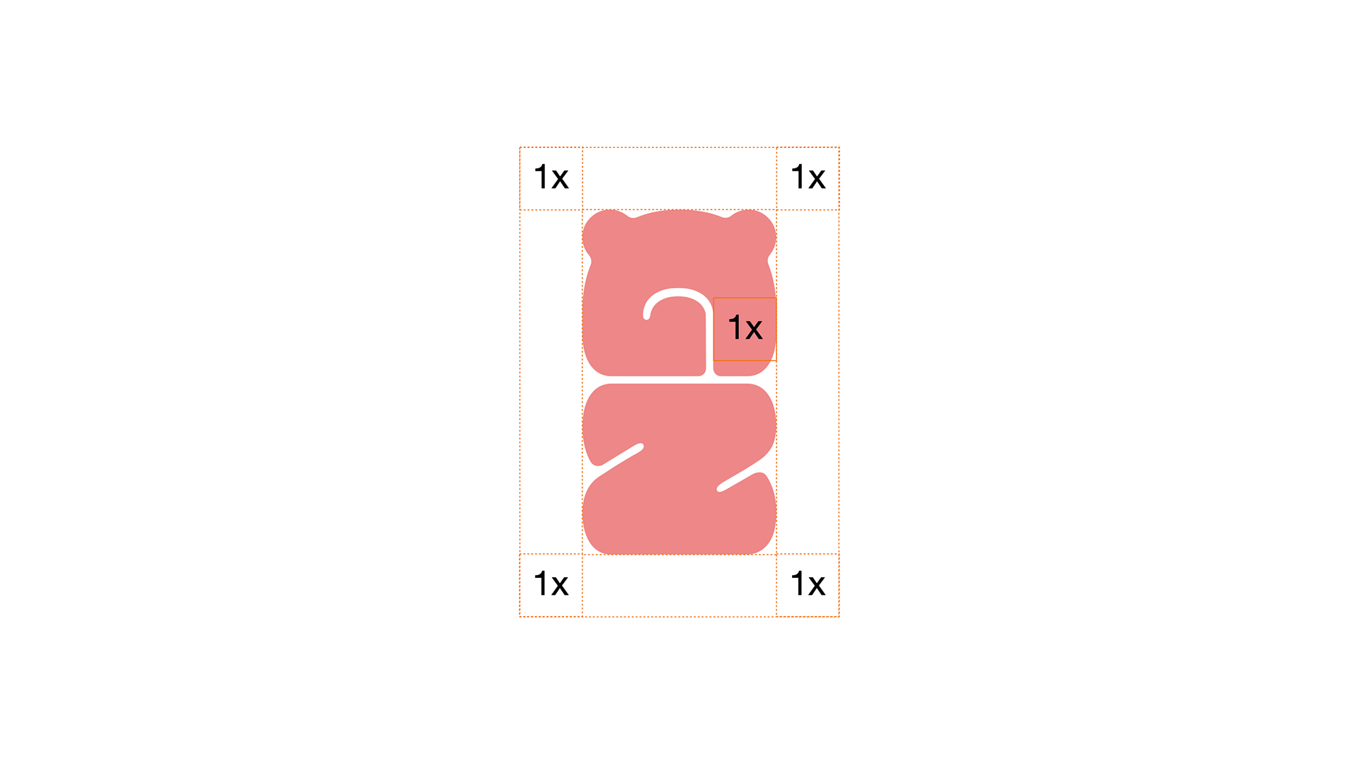
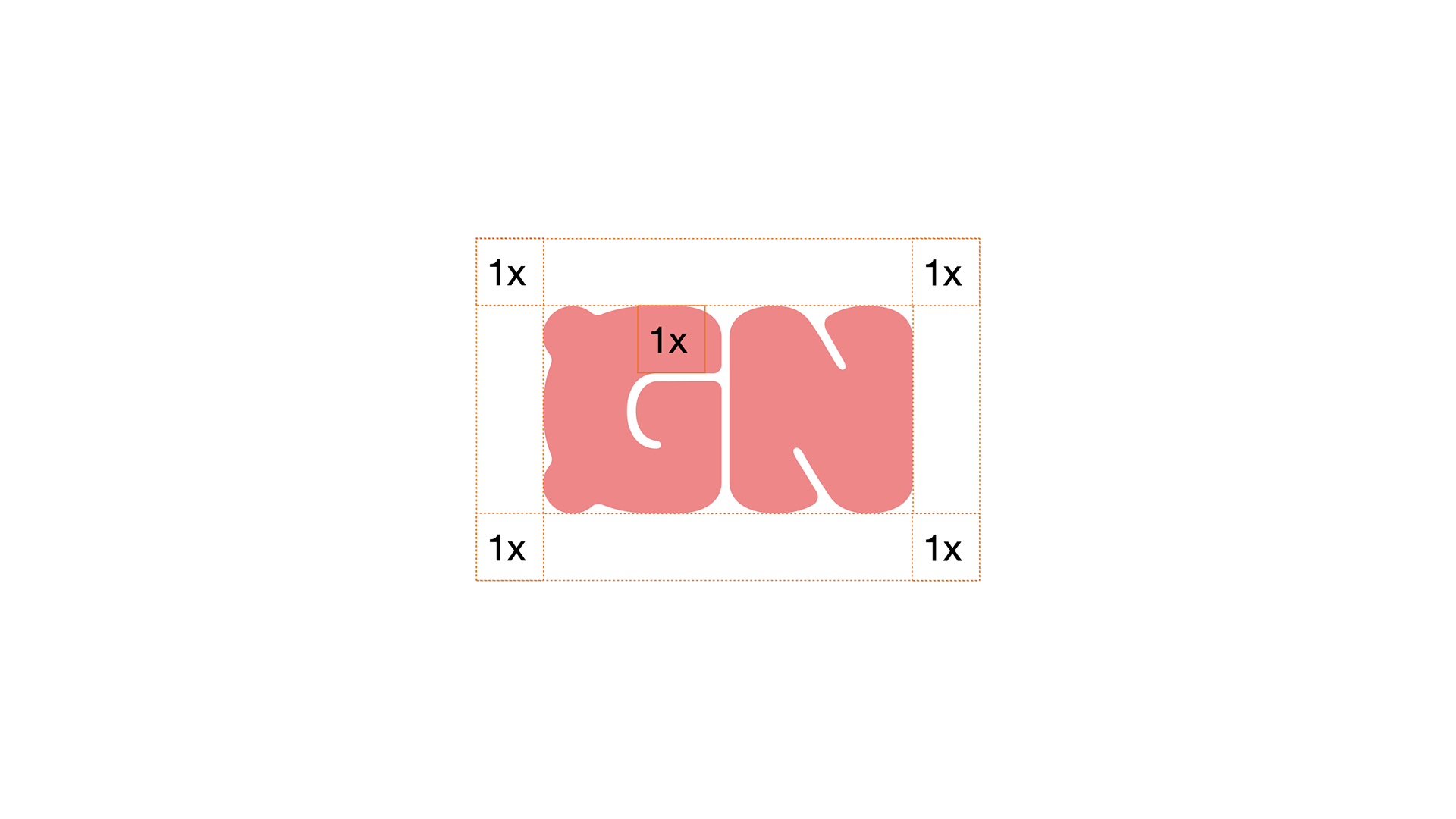
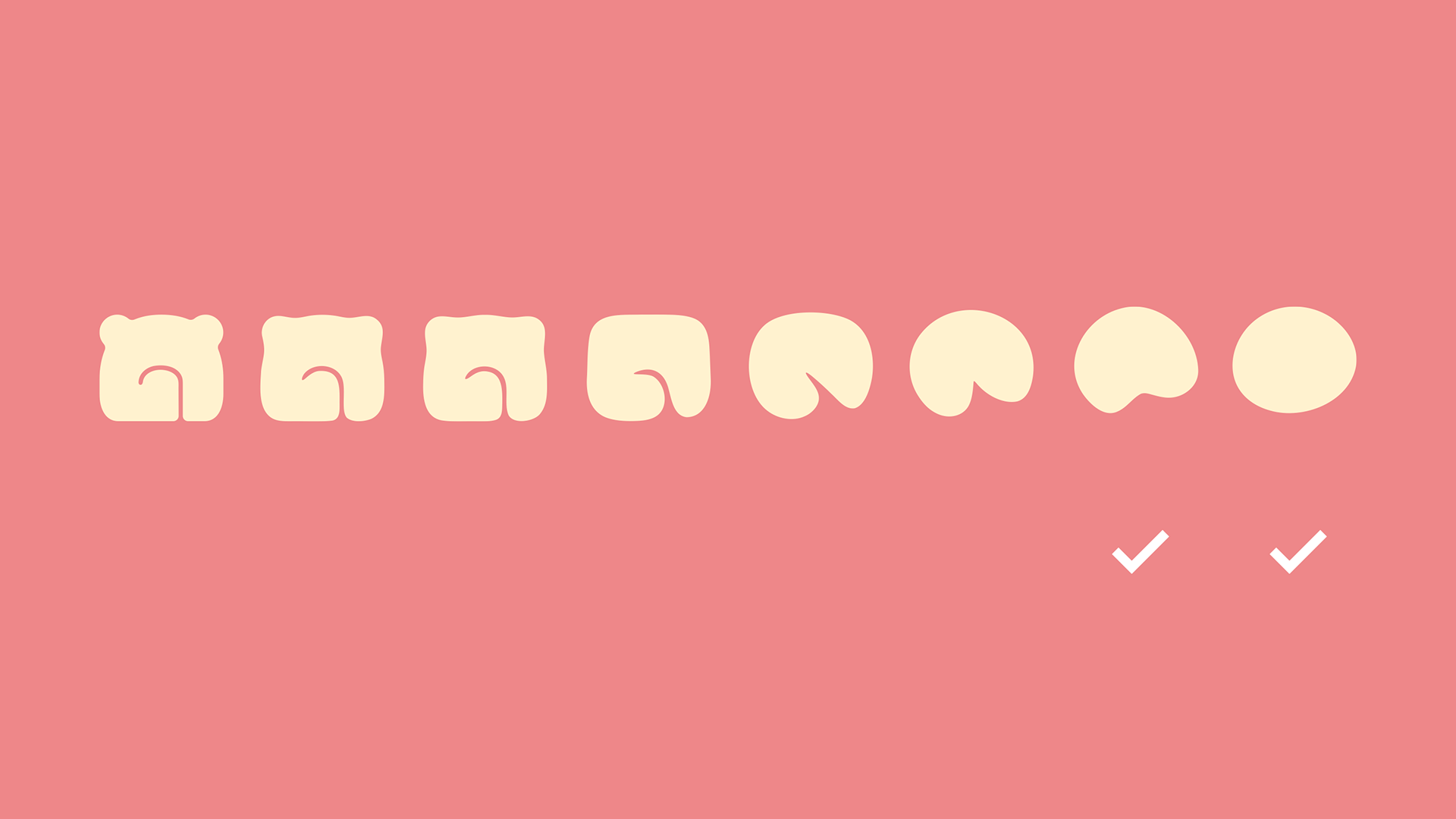
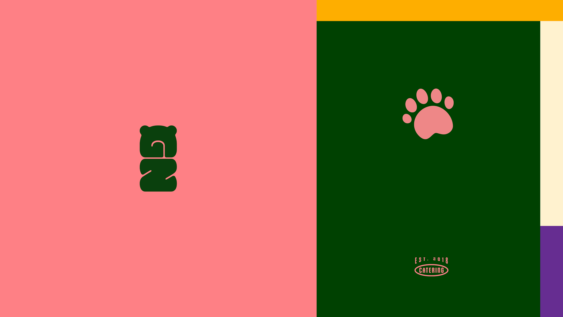
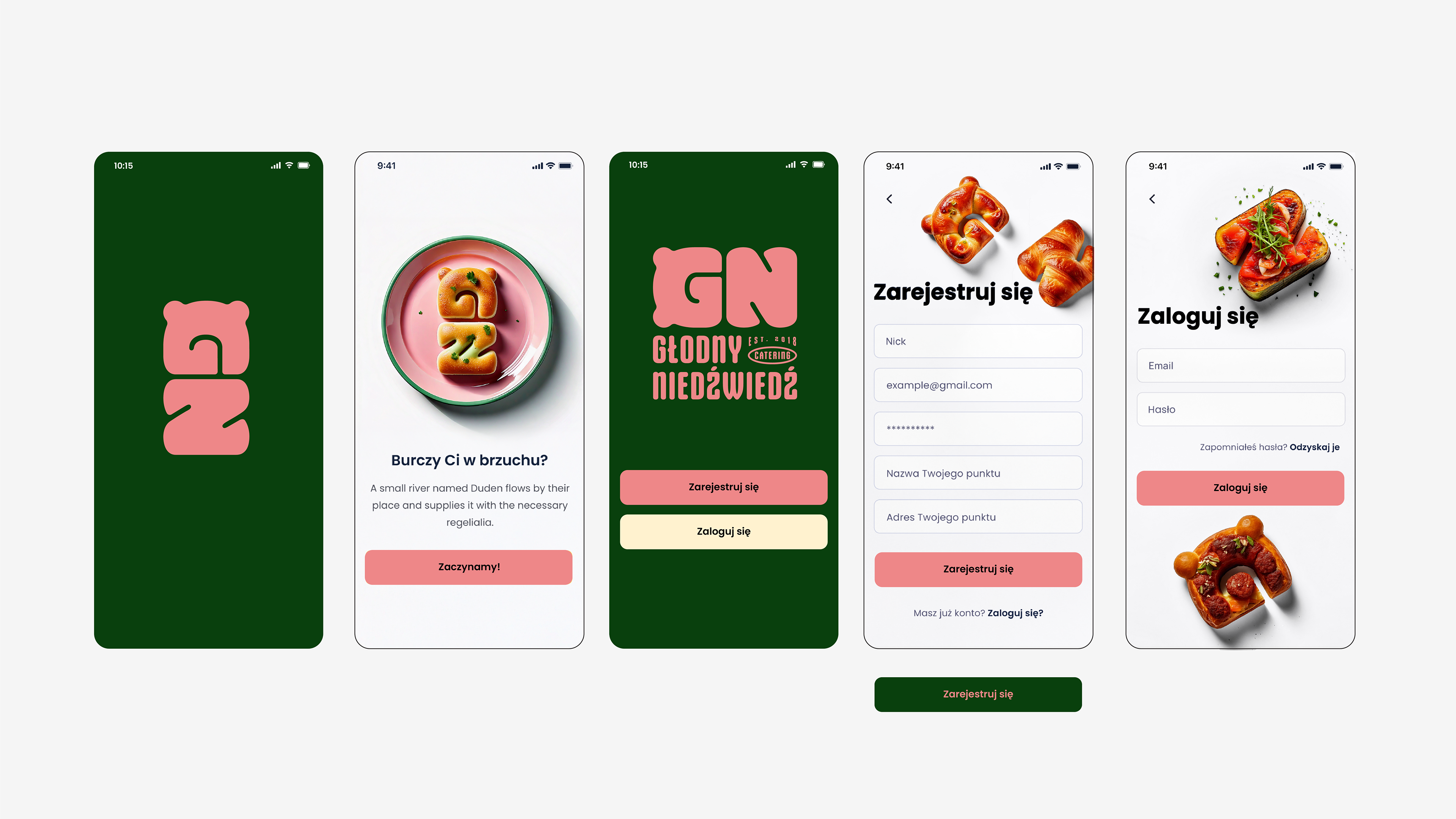
While working on the concept, I wanted to simplify the form as much as possible and create a mark that would be easy to recognize and remember. The main idea was to combine the letters “G” and “N”, the initials of Głodny Niedźwiedź. Placed vertically, they create a simple bear shape, so the symbol connects directly to the brand name while keeping its most recognizable element. I also wanted it to work well in different sizes and across different applications.
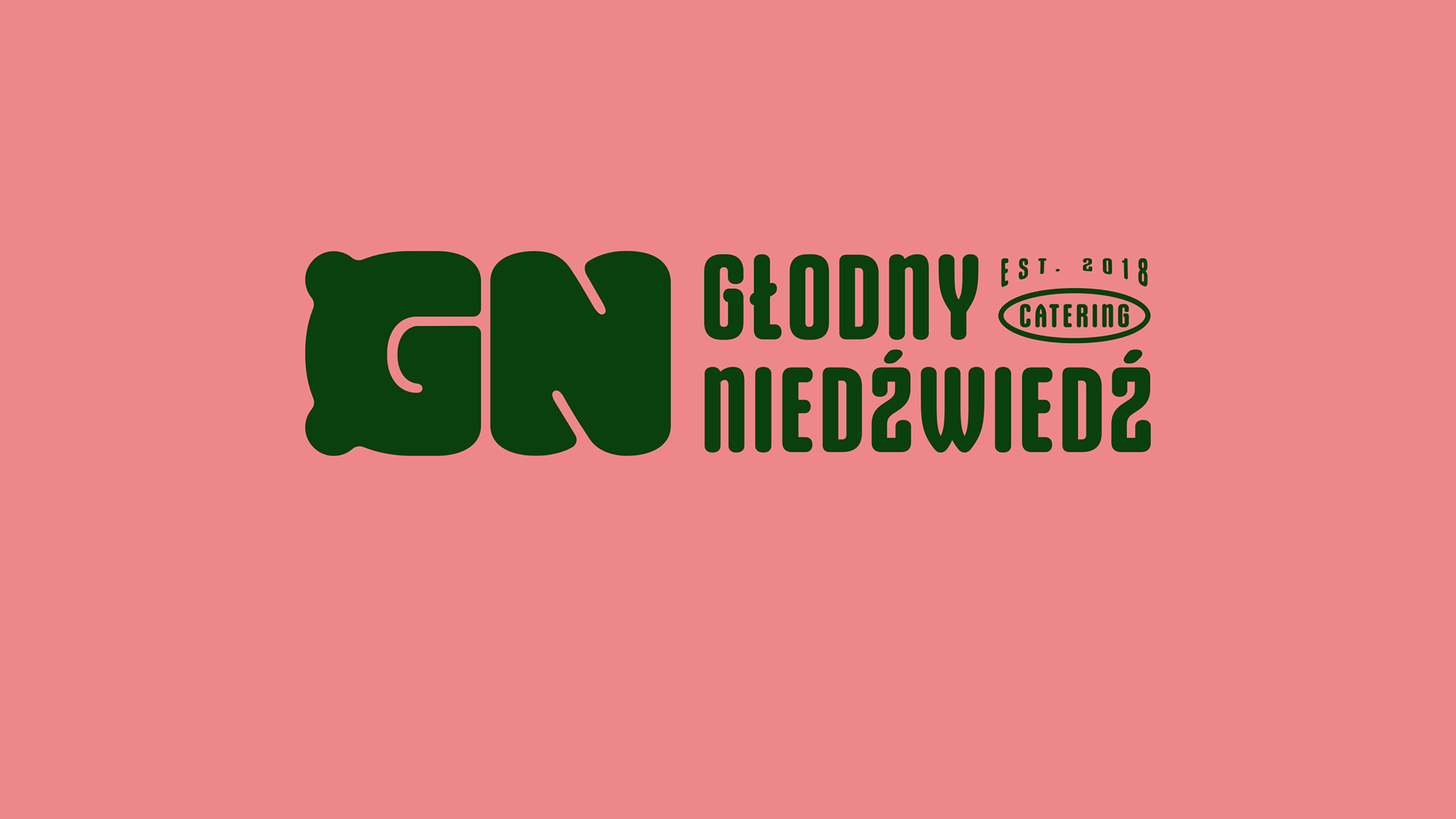
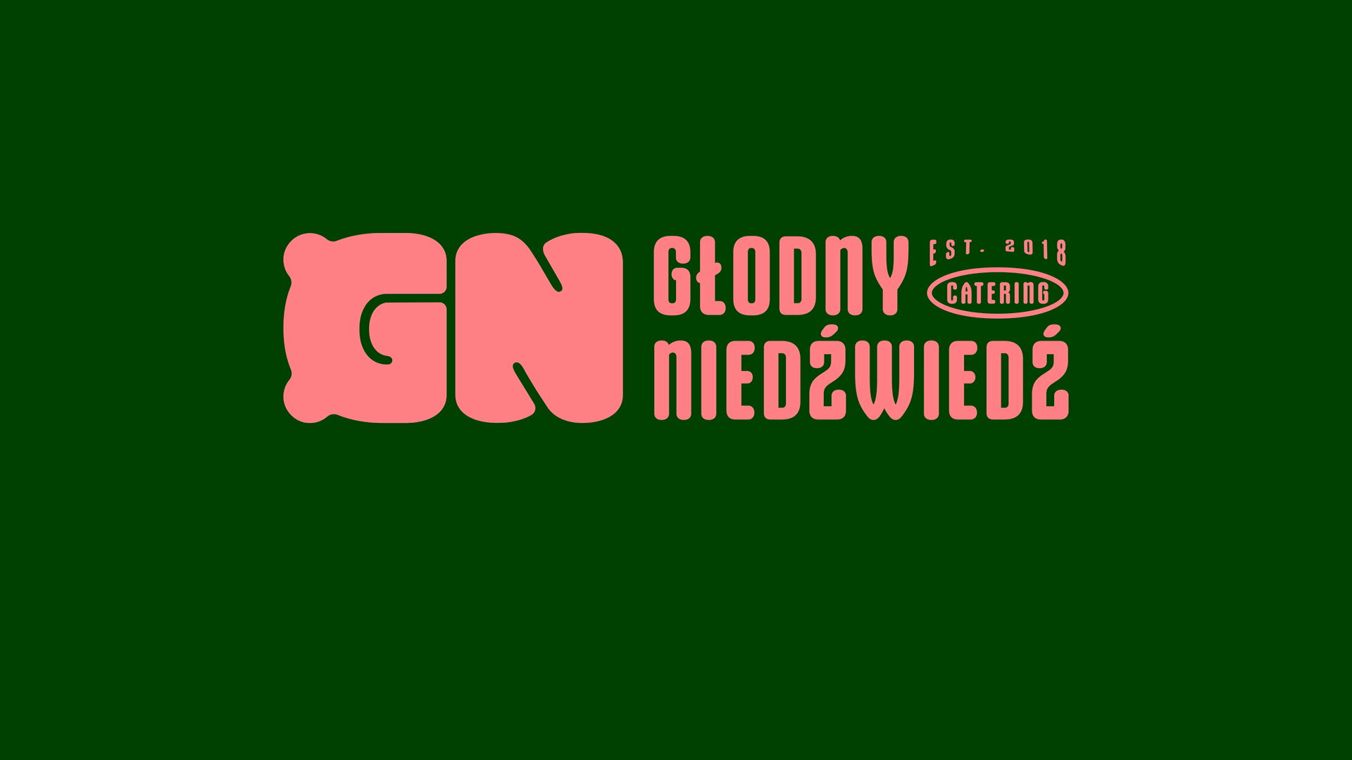
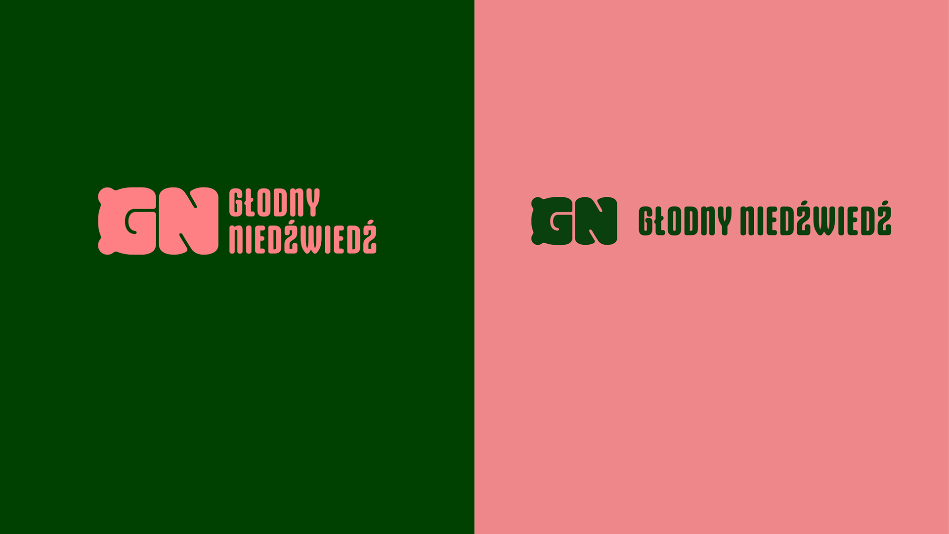
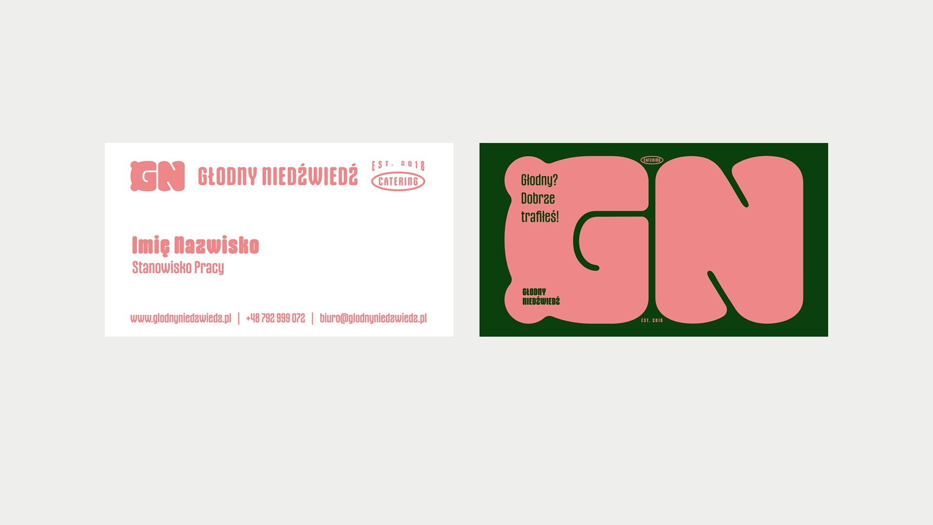
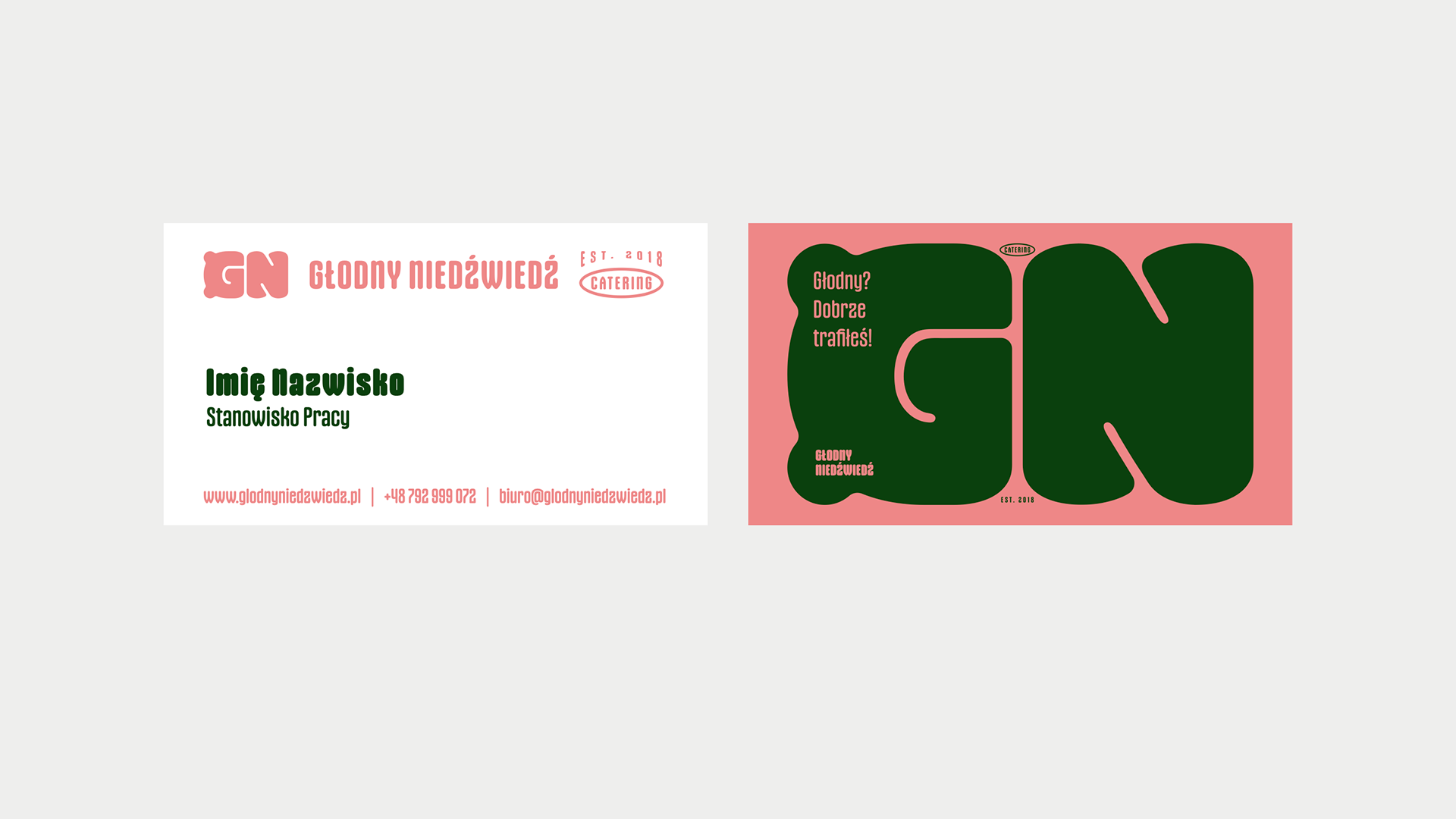
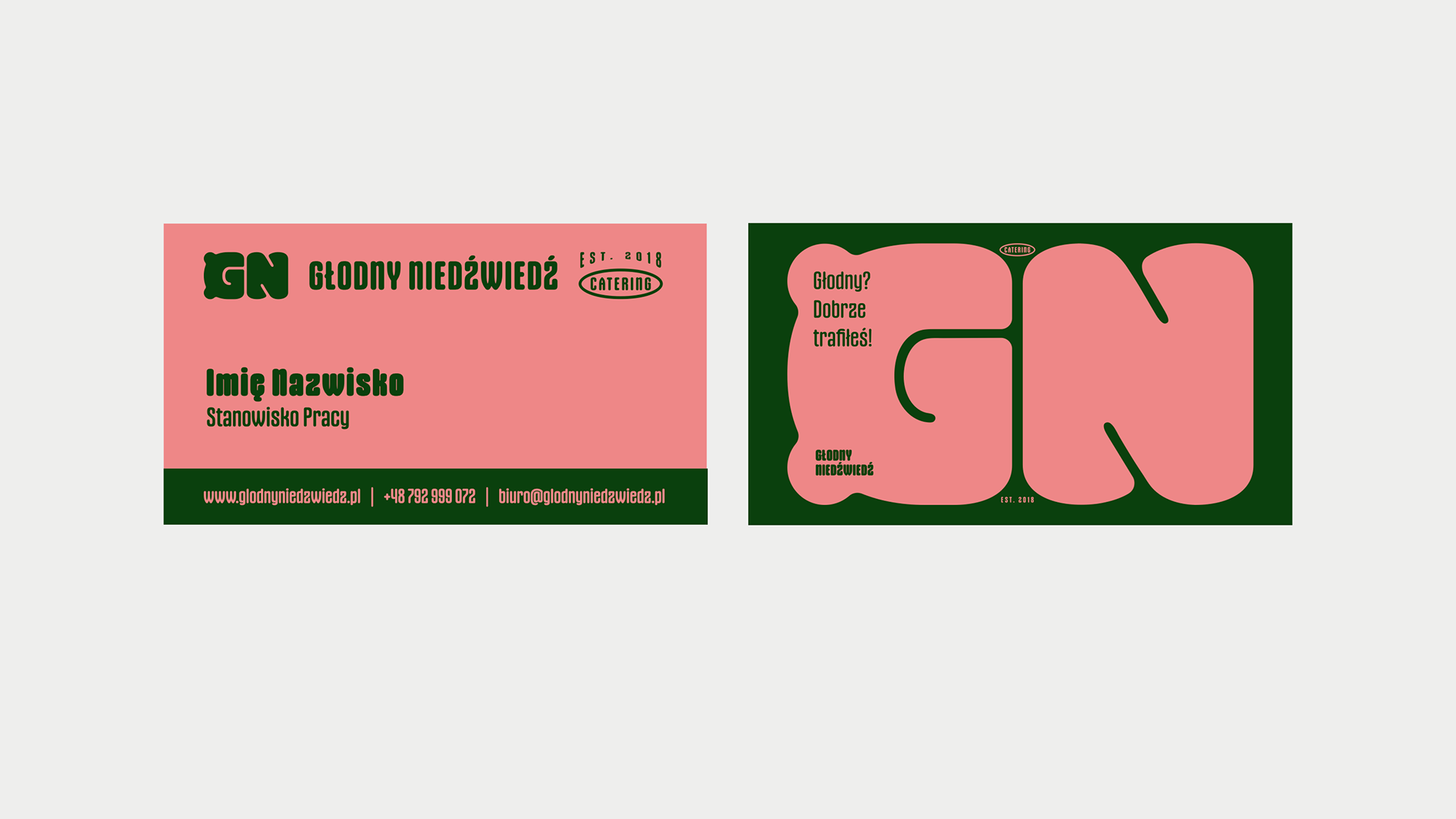
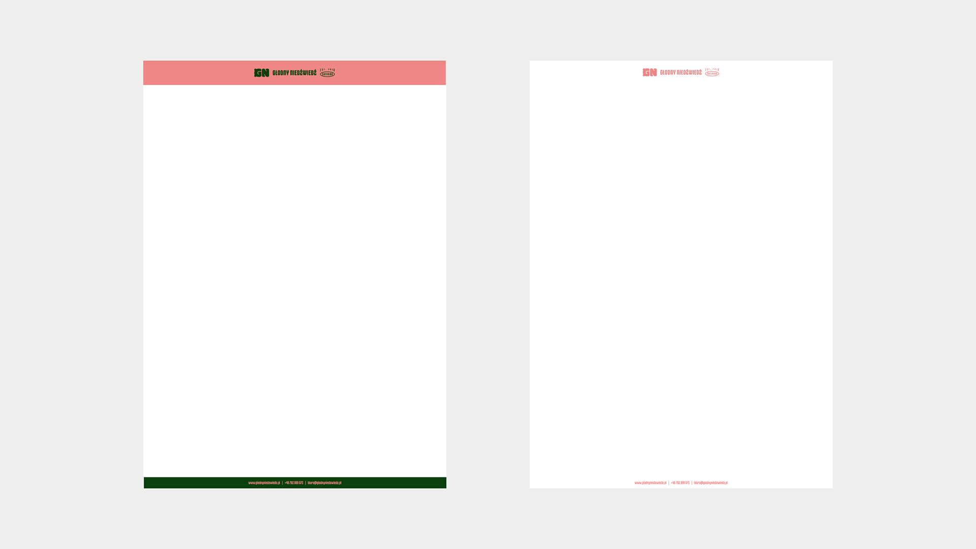
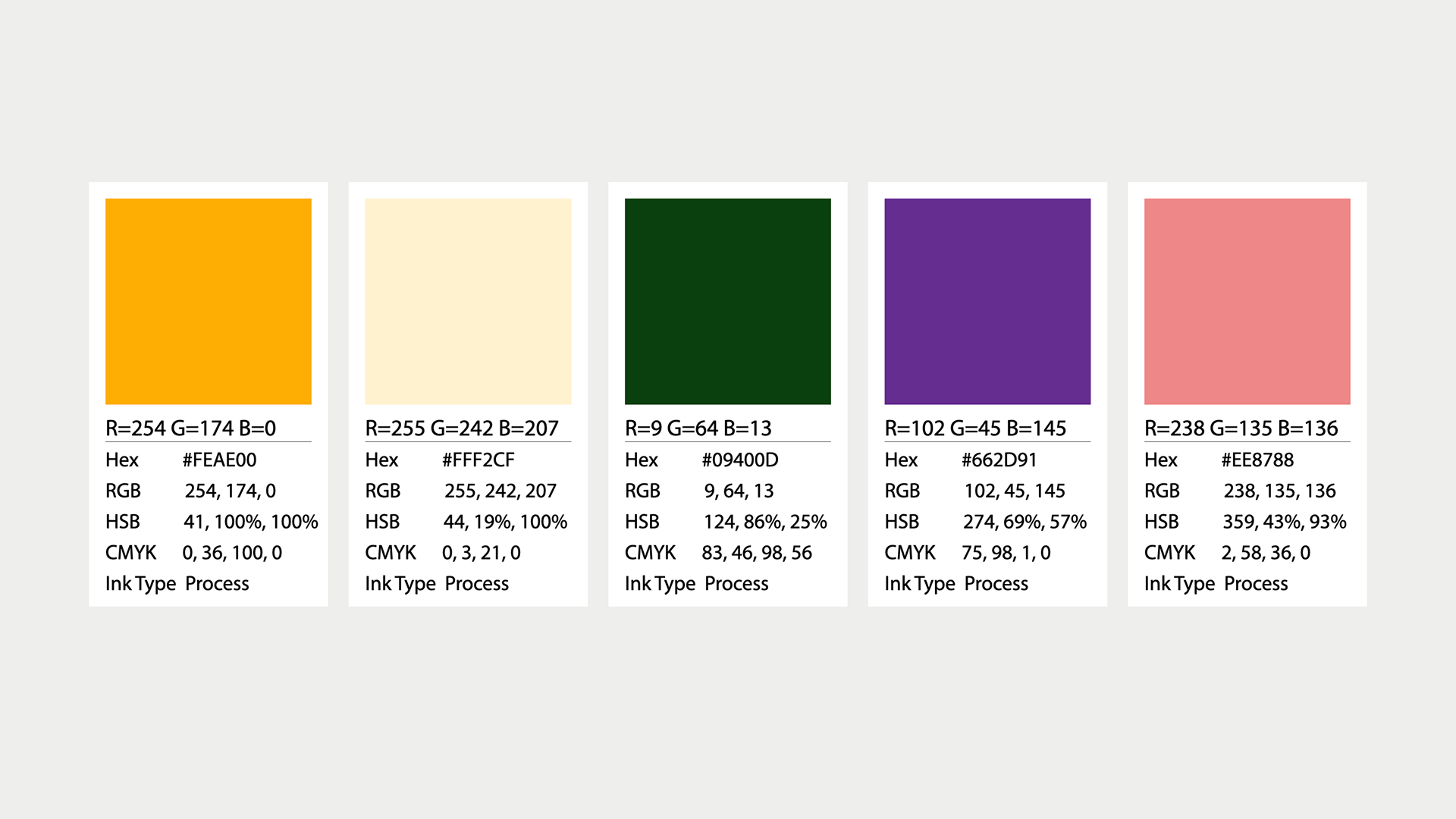
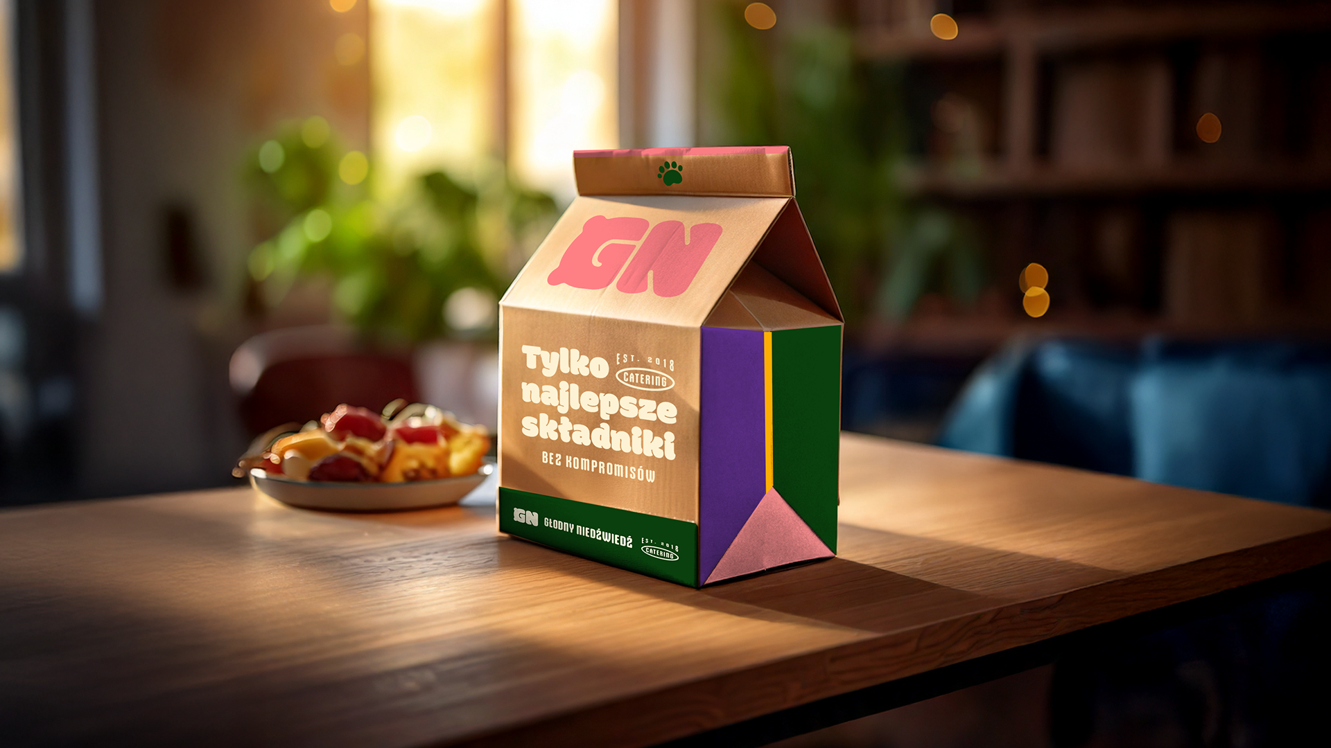
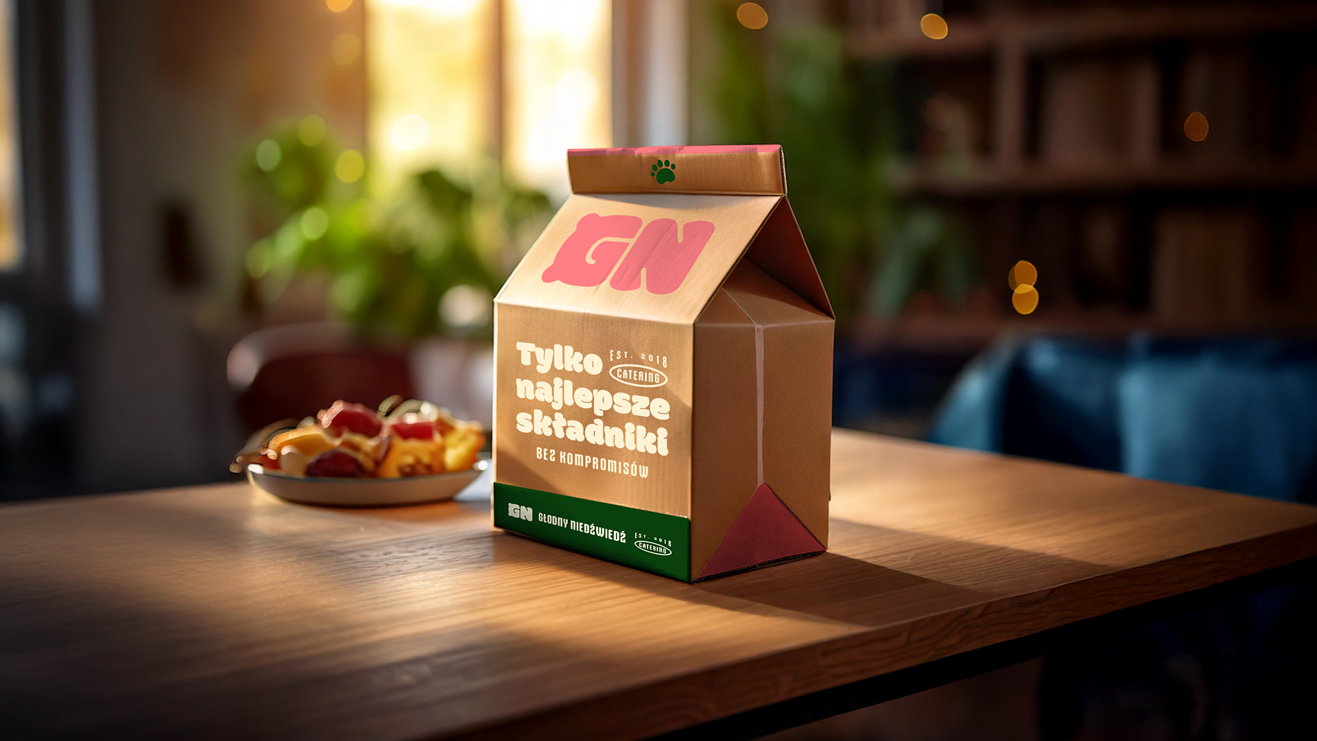
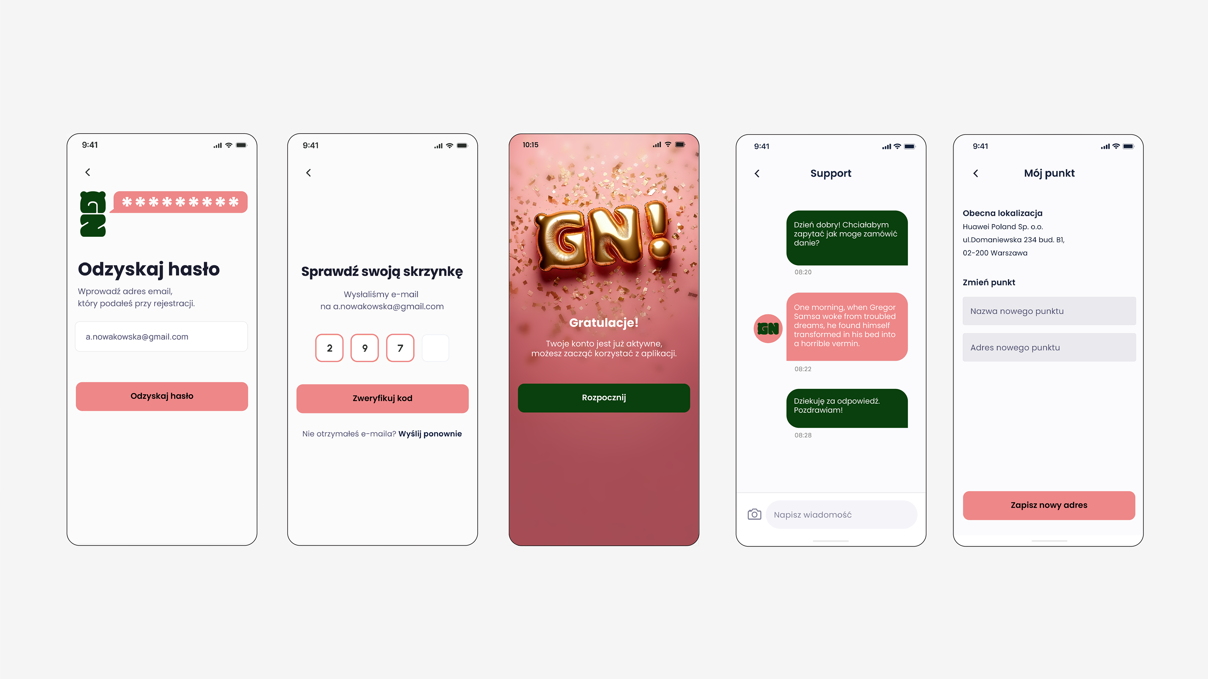
Once the logo was solved, I developed the project into a full visual identity. I created all logo versions, supporting marks, the color palette and brand guidelines. I also designed how the identity would work across the app, website, corporate materials, packaging and other brand elements.
Client: Głodny Niedźwiedź
Project: Brand Identity
Responsibility: Concept, Logo Design, Visual Identity, Brand Guidelines, Digital, Packaging
Project: Brand Identity
Responsibility: Concept, Logo Design, Visual Identity, Brand Guidelines, Digital, Packaging