

Fradox:
Built Around the X.
I created the visual identity for Fradox, a London-based cleaning company working across homes, offices and larger commercial spaces.


The starting point was a simple shape inspired by a vacuum head, a brush and a dustpan.


By mirroring two of these elements, I created the letter X, which became the brand’s main symbol. I then carried the same angles and cuts across the remaining letters, designing the entire FRADOX wordmark from scratch.
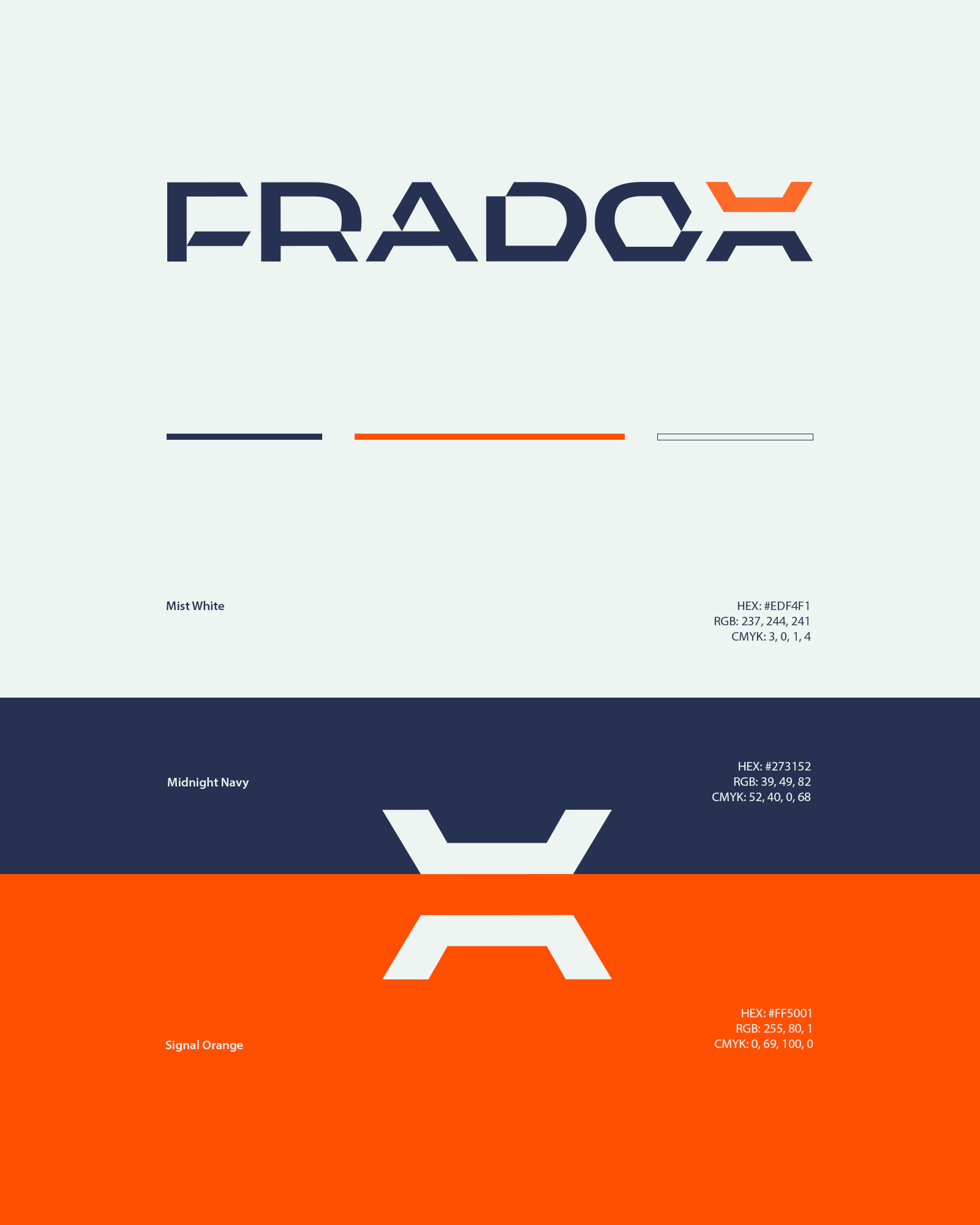

The goal was to create a clean, modern identity that feels minimal but still has its own character. Something that works just as well at a small scale as it does across workwear, equipment, company vehicles and digital materials.


The project included a complete visual identity and brand guidelines. Here, I’m focusing on the logo construction, color palette and selected applications. What I like most about this project is the simplicity of the symbol and how many associations fit into a single shape.
Client: Fradox
Role: Creative Director & Designer
Responsibilities: Visual Identity, Logo Design, Custom Wordmark, Color Palette, Brand Guidelines, Art Direction, Brand Applications
Role: Creative Director & Designer
Responsibilities: Visual Identity, Logo Design, Custom Wordmark, Color Palette, Brand Guidelines, Art Direction, Brand Applications
Follow me on Instragram
Or visit my website hubertbarczak.eu
